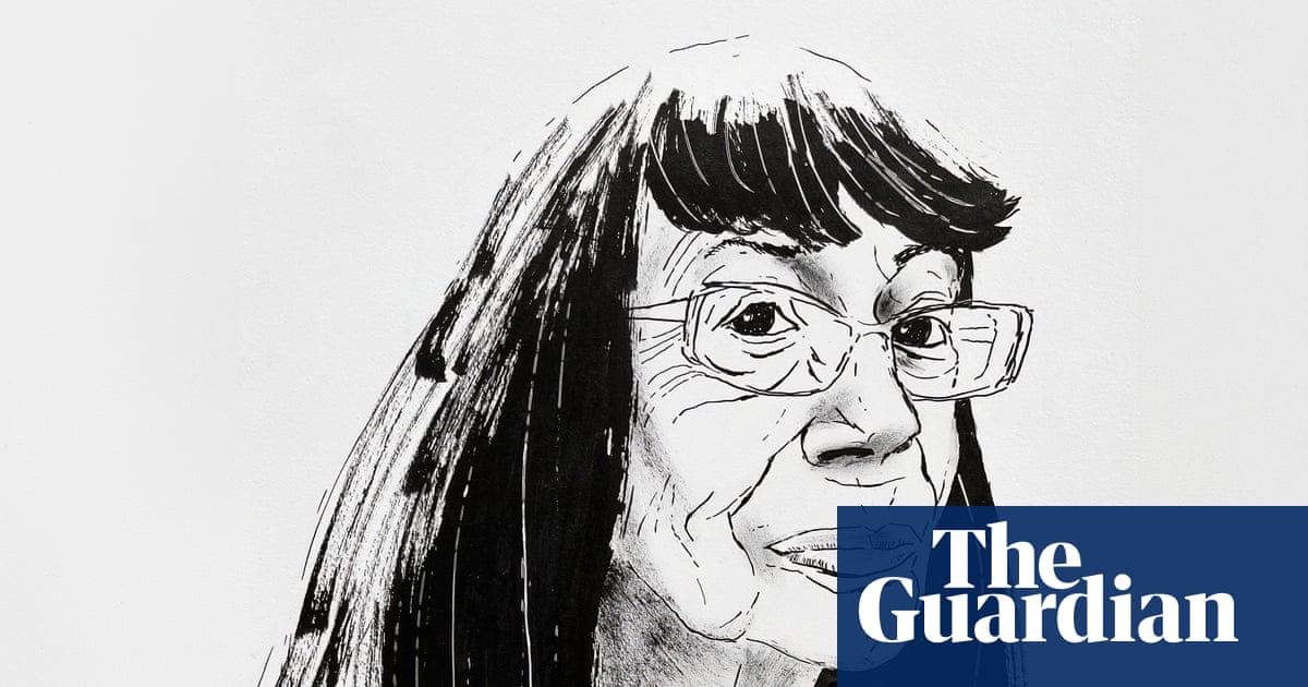
Stuffed with a barrage of road signs, artful modernist chairs and all the tools of her trade, Margaret Calvert’s studio occupies the ground floor of her trim terrace house in Islington, London. She still draws by hand, using coloured pencils, ink pens and gouaches, echoes of a simpler time when there were neither computers nor gazillions of Pantone colour options. “There was also no such thing as graphic design back then,” she says. “It was just called commercial art.”
Only a handful of graphic designers have had a typeface named after them. One of the earliest was the 18th-century Italian Giambattista Bodoni, whose fonts have conferred on him a kind of immortality. But his efforts were not to everyone’s taste: William Morris was said to have loathed Bodoni’s letters, grumpily raging at their “sweltering hideousness”.
Like Bodoni, Calvert has been inducted into the graphic equivalent of Mount Olympus. The Calvert typeface can be appreciated on the Tyne and Wear Metro, finessing wayfinding from Gateshead to North Shields and beyond. In fact, the black M on a yellow background, instantly signalling Metro, has become a civic and graphic landmark across the north-east. It might even have cheered up William Morris. No “sweltering hideousness” here.
Designed in 1971 for the French new town of Saint-Quentin-en-Yvelines, but rejected for being “too English”, Calvert is a contemporary version of a slab serif. (Serif refers to letters with strokes abutting their ends – you’re reading one now). These bold, attention-grabbing typefaces date from the 19th century. Calvert has been described as having “vitality and elegance, avoiding the stiff and mechanical”. The same might be said of the woman herself.
She drew from a very early age. “I would have been three or four,” she recalls. “And I can remember drawing on the floor on huge sheets of paper, not with crayons, just with a pencil. It was always a house with a chimney pot and a family standing in front.” She especially enjoyed life drawing. “I think that’s why I’m so fascinated by typefaces and lettering, because I think of a letter’s form as if it were a skeleton fleshed out in different ways.”
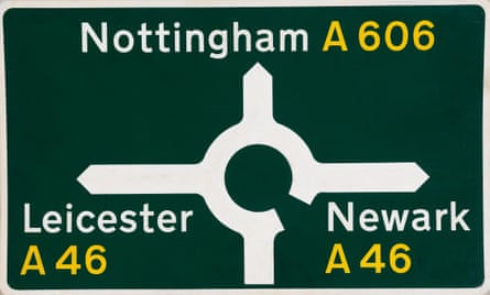
Calvert turns 90 this year and – in an extraordinary design and teaching career that began in the late 50s and still continues – has become the embodiment of a national treasure. She’s even been on Top Gear, hurtling down a motorway in a white Vauxhall Insignia with James May in 2010, discussing the technicalities of road signs, her graphic legacy to the nation. Anyone who has ever driven on a British highway will have encountered the sign system she designed with Jock Kinneir as part of the ambitious postwar modernisation and expansion of the nation’s road network, unifying and rationalising what had become a confusing and potentially hazardous array of lettering styles, colours and sign layouts.
Lasting from the late 50s to the mid 60s, this was a colossal undertaking, but Calvert and Kinneir’s lucid, legible and eminently elegant signage has attained design-classic status. Officially implemented in 1965, and largely unchanged, it was “a house style for Britain”, embracing modernity with the aim of making everyday things better for everyone. Roads are safer, driving more pleasurable. Design historian Robin Kinross praised the project for highlighting “the role design could play in public life”.
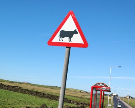
Calvert designed many of the familiar warning pictograms, including the silhouettes of a careering deer and cantering horse, inspired by the pioneering photography of Eadweard Muybridge. Farm animals are denoted by a static cow, based on a real one named Patience she encountered growing up at a relative’s farm in Wiltshire. Calvert herself features on the sign for children crossing, as a girl with distinctive bobbed hair leading a small boy across the road, rather than the other way around. Though she is intensely modest, she always means business.
Kinneir, who taught Calvert graphic design at Chelsea College of Art in London and later invited her to join his office, described her as “the student who applied herself most rigorously to what she was doing. She kept her head down and worked like a maniac.”
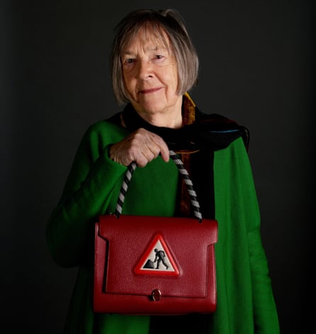
Aptly, Woman at Work is the title of a mighty new tome in which Calvert relates the intertwined story of her life and career. But it also stands as a history of postwar graphic design in Britain. The cover is a version of her famous “men at work” pictogram, playfully altered to incorporate Calvert’s (still) bobbed hair and a skirt. Visually refined, insightful and wryly humorous, it is quintessential Calvert. Considering the longevity and brilliance of her career, it’s also long overdue – but she was happy to wait and pick her moment. “I think the timing is absolutely right,” she says, “because I’m still involved in interesting design commissions.”
Among other things, an exhibition in Kyoto beckons, following a popular 2020 show at London’s Design Museum. And Give Way to Design, a documentary by Argentinian film director Patricio Orozco, tracing the history of road signage in Britain from still extant Roman milestones to the legacy of Calvert and Kinneir, will have its UK preview in March.
Born near Durban in South Africa, Calvert came to Britain as a teenager, arriving in 1950. While studying at Chelsea, she luxuriated in a nascent swinging London, loving the freedom of art school where “you could just spend a whole week painting a still life”.
She seemed destined for a career as an illustrator or art teacher, but then went to work with Kinneir in his cramped mews office in Knightsbridge. “One client described it as ‘A man, a girl and a hole in the wall’,” recalls Calvert. To begin with she did a bit of everything, “including typing, which I taught myself. And I did it really badly. If there’s something you don’t want to do, just do it badly and no one will ask you to do it again.”
By 1964 she had been made a partner, and was designing across all scales from luggage labels, posters, letterheads and books, to signage at Gatwick airport and an identity for Britain’s railways, all with the same scrupulous care for supreme clarity and legibility. She hates the word branding, though, saying it reminds her of animals.
After Kinneir’s retirement in 1980, she embraced teaching, working at the Royal College of Art for nearly 40 years. “Graphic design was thought to be a man’s discipline,” she says. “So I think it was quite a surprise for people to find me there.” She started out teaching typography to industrial design students. “I got them to redesign the information graphics on parking meters, which some of them took very seriously.”

Although she became the head of graphic design, her time at the RCA was punctuated by upheavals and imbroglios, with departing heads of department, constant reorganisation and changes to the curriculum. But for her students – many of whom are now successful designers and educators – she was a supportive influence, encouraging critical thinking and exploration of disciplines beyond graphics. One of her former students, Stefan Bufler, a professor of identity design in Augsburg, says she had the ability to “instantly identify any excess baggage that stops an idea from flying”.
Transport, the lettering Calvert and Kinneir devised for the road signage commission, is possibly the most familiar font in Britain. It has since migrated into the digital realm, subtly re-conceived by Calvert and Henrik Kubel, another former student. Since 2012, New Transport has been used on gov.uk, the UK government website, its shapes working perfectly within the cybersphere, a testament to its legibility and enduring aesthetic appeal.
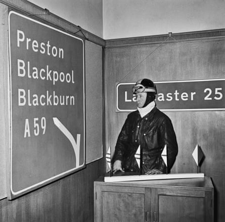
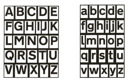
However, as Calvert memorably describes in Woman at Work, its original gestation was far from straightforward. The very idea of a sans serif typeface (no end strokes) and the use of lower as well as upper case letters (“more legible because you read by word shape”) was challenged by traditionalists.
Laborious trials were undertaken, recorded in archive pictures showing flat-capped men solemnly sitting in an airfield as a car trundles past with a road sign for Oldham and Smethwick strapped to its roof. Ultimately, Calvert and Kinneir – and modernity – prevailed in what she describes as the “Battle of the Serif”. The entire intrigue has the makings of a delicious film drama about Britain’s tortuous relationship with progress, perhaps with the young Margaret played by Jessie Buckley.
Apart from the time she used to zip around in a white Porsche 356C (“I bought it for its beauty, but it kept breaking down. It cost me a fortune to run, but I did love it”), Calvert is notoriously unshowy. Much like her work, which does not call attention to itself yet is the essence of human-centred design, easing legibility and movement around everything from transport systems to buildings or websites. “Design for me is a process,” she says. “It’s about improving things. Basically, it’s head, heart and hand.”